Customers these days are in constant search for deeper experiences, more personalized approach and solutions that exceed their expectations. But they are also ready to reward the extra effort companies make. According to a research from Capgemini Digital Transformation Institute, 81% of consumers are willing to pay for a better experience. This is a big opportunity for organizations that invest in seamless digital customer experience strategy.
However, it seems that e-commerce companies still struggle when it comes to turning visitors into customers. Average e-commerce conversion rates are 1% – 2%. Even if you are doing everything right, you can win the sale around 2% of the time.
There is obvious room for improvement. Even though customers expectations are not linear, as they were in the past, there are few important points that are crucial in order to improve conversions.
In the early stages of the shopping experience, it is critical to provide enough information, to inspire potential buyers and to convince them that you are offering the right product. After you generate awareness you have to engage visitors in order to make them stay and convert them into buyers.
“The trouble is, you think you have time”.
But the truth is you don’t! Studies show that the average web user forms an opinion about a brand within two-tenths of a second, leaving next to no room for error. So, the question remains the same: How to retain visitors? Needless to say that flawless usability, accessibility, performance and aesthetics are basic expectations that your visitors have. Without this, you don’t stand a chance. What else?!
Show, Don’t Tell
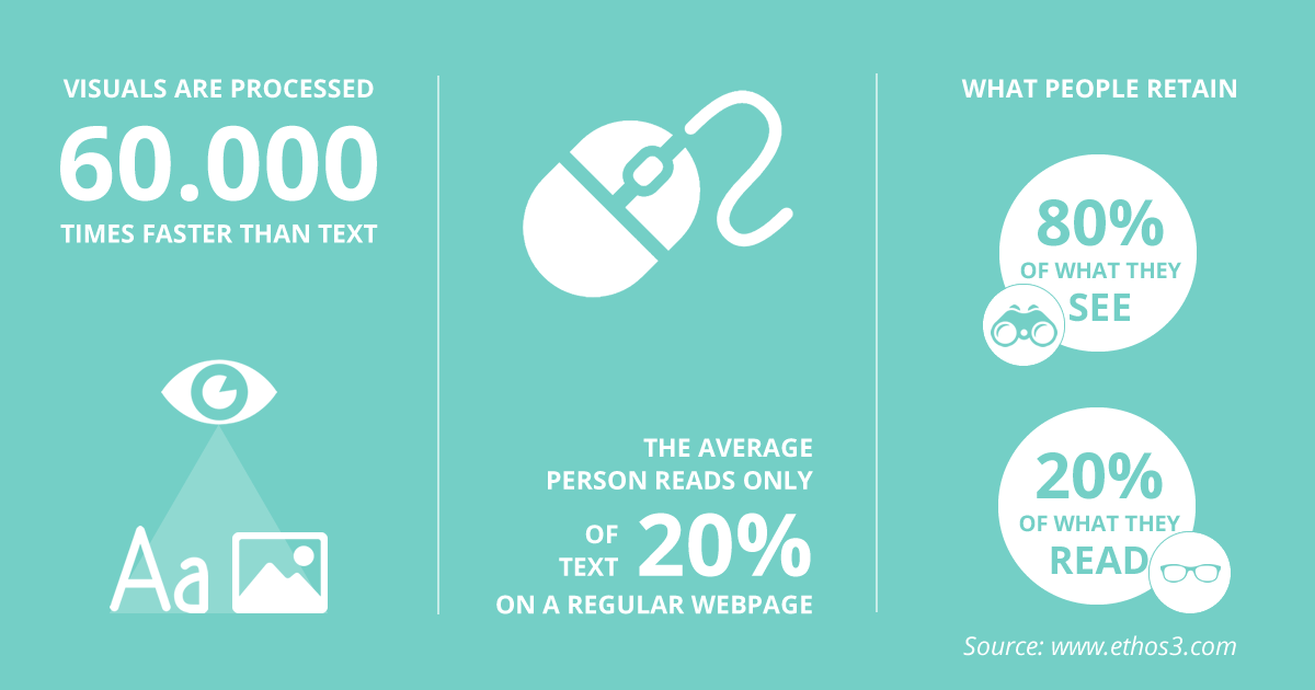
Customers want a multi-dimensional purchase which leverages all their senses. According to Ethos3, human brain processes visuals 60,000 times faster than text, and 90 percent of information transmitted to the brain is visual. If we add the fact that website visitors typically read only 20 percent of the text on a page than it becomes clear that focus on visual content can make a difference for your business.

Still, remember that visual storytelling can be a double-edged sword. Forget about the perfect stock photo. You have to be original. While the stunning visual presentation and good UX are important for every business, they are even more important for complex sites or applications, retail or online sites, and considered purchase products that are expected to last a long time.
Small details make big difference, especially in e-commerce
We live in a competitive world. Good isn’t good enough anymore. You have to strive for excellence by offering world-class products and solutions. In e-commerce competition is cut-throat. This means that ingenuity has become critical. One of the downsides of e-commerce is that no matter how perfect your product pages are, the customer will never be able to have the real product in his hand, as in a physical store.
People want to see exactly what they are getting. One of the biggest online consumer concerns these days is product authenticity. As important as it is to have quality images on your product pages, it is also important to display the product in as many angles and details as possible.
Nuances can make or break your business in the furniture industry
Everything that was mentioned so far is even more emphasized when it comes to the furniture industry. You have to provide superior online customer experience in order to beat the feel of a rich velvety texture, soft cushions, and comfortable seat.
Having in mind that furniture is a considered purchase you have to provide confidence-inspiring information and content in order to equip your prospects and to simplify their decision-making process.
However, there is still a lot of work to deliver a stellar omnichannel experience in the furniture industry. As stated in the 2017 Omnichannel Furniture Benchmarking report from Blueport Commerce, on average, furniture retailers have only 31% of the top 50 evaluated features across eight categories, in the shopping journey from engagement through paying for a purchase.

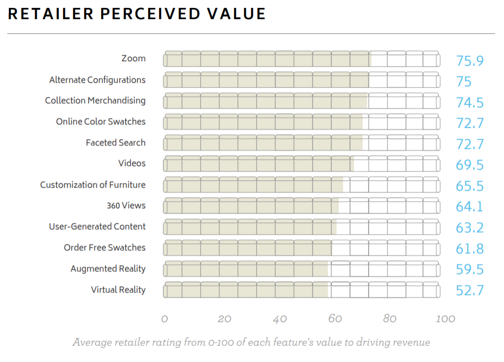
Source: 2017 Omnichannel Furniture Benchmarking report
According to this report, retailers perceive the zoom function as one of the 10 most valued features for providing augmented and consistent information across channels. With 75.9 points, zoom is number one feature for rich furniture merchandising. Still, regardless of the importance retailers see in this feature, only 65% of the respondents confirmed that they have the zoom feature implemented on their product page.
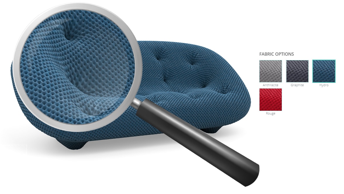
When it comes to furniture, close up, magnified view can effectively communicate the details of your products in ways product copy cannot. Allow your visitors to better scrutinize your products because that is the only way to turn them from browsers into customers.
3 things you should know when implementing zoom product feature
The Zoom feature on product pages has become increasingly popular. This feature allows visitors to zoom on specific details on the product image and to get a feel for the product, thus diminishing the gap between e-commerce and physical stores. Still, there are few things that you have to take into consideration when implementing this feature:
1. Zoom increases customers confidence– The magnified view option shows that you are confident in the products that you are selling. On the other hand, customers love the zoom feature because it reassures them that they are making the right decision;
2. Product visual quality matter– Be careful, the zoom feature can sometimes cause more harm than good if you don’t take the quality into consideration. The photo should remain in high-resolution and clear, even when zoomed in. That is the only way to highlight the details of your products;
3. Fast load time is crucial – According to Adobe, images that don’t load or take too long to load cause a consumer drop-off rate of 39%. Technical considerations and optimized product images are a crucial base for good zoom feature.
Product visualization and Zoom done right
This tactile experience is only one of the features that will give you a competitive advantage. With the combination of 360 spin view, 4K HD zoom and the possibility for unlimited configurations, your customers will enjoy in a futuristic online furniture store. In this industry, the ultimate shopping experience is the finish line, and business growth is the main prize.

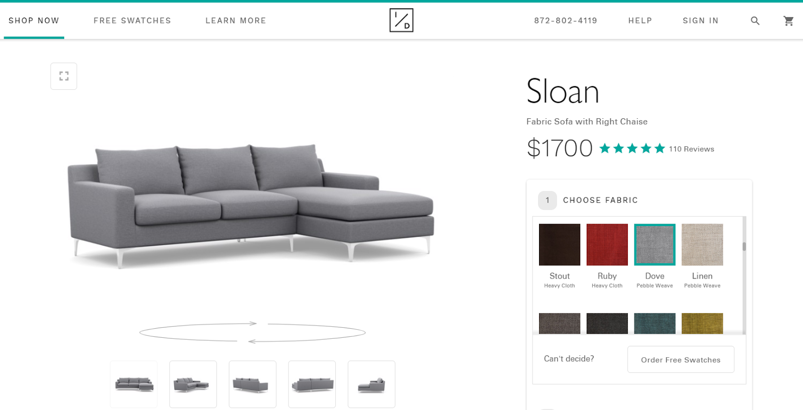
With Cylindo’s platform, our client Interior Define set new standards for online and in-store furniture visualization which resulted in increased conversions and sales. Given the fact that they offer a wide range of products with different colors and fabrics, they utilized the 360 HD Viewer for a remarkable omnichannel experience. Their inspiring story is proof that visualization is essential in the furniture business and that the zoom feature is an important piece of the puzzle.
People are emotional decision-makers and they are constantly seeking for tailored experiences that go beyond texts and numbers. Gone are the days of posting one photo with a short description and a price tag. We live in a world where seamless customer experience is the ultimate competitive battleground for furniture industry players. Nuances can make or break your business.
Remember, the sale is in the details.
Ready to provide next-gen experience for your customers?
